Projects
Unified Onboarding. Xing
SENIOR PRODUCT DESIGNER | 2024


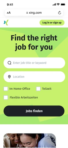
Unified onboarding process simplifies user onboarding for both existing and new users. By integrating with accounts, we offered a seamless login or registration experience, eliminating the need for separate for multiple pages to make it easier and faster onboarding.
OVERVIEW
01
Problem
Xing users faced challenges with two separate sign-in/up screens , a long onboarding process with multiple screens and an outdated onboarding process that hindered user engagement.
Solution
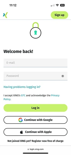
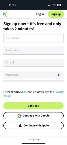
Unify Login and Registration streamlines onboarding by combining multiple screens into a single, simplified flow. This addresses user pain points and improves retention by making the process quicker and more efficient.
Role
I was the sole Senior Product Designer for this project, collaborating with engineers and product owners and ensuring a successful launch within 7 weeks.
PROCESS
02
The process was based on the Double Diamond. We conducted user research to identify key issues and pain points, defined the essential tasks and created designs.
Discover
Define
Develop
Deliver
Designing the Things Right
Designing the Right Things
Discover
Journey Mapping
User Analysis
Market Research
Define
User Flow
Hypothesis
Develop
Designs
Summary
Deliver
Learnings
Takeaways
DISCOVER
03
Journey Mapping
Reducing Friction and Improving the Entry points, product features and leading suggestions
Mobile
Log-in Page
Sign-Up Page
Logged Out Homepage

Desktop
Log-in Page

Sign-Up Page
User Analysis
Aside from the basic competitive research and some qualitative/quantitative data, I accompanied by customer support lead and PM conducted interviews with new and existing users trying to stay unbiased and as neutral as possible. We were looking forward to pointing out common pain points from the quotes and translate them to clear goals.
From the usability sessions with users, we extracted some constructive human insights. Generally, they appreciated the ease of use and speed of onboarding. The most frequently met weak point was that “to integrated less number of screens and make the process less as less lengthy as possible”.
62
%
User find it confusing between Login and signup screens
28
%
Users feels the screens need improvement
Technical process
The project involved migrating the redesigned onboarding flow, which addressed user and product issues like multiple sign-in/up screens, to React Native. To ensure a smooth transition, we adopted a step-by-step approach, allowing developers to proactively identify and address potential backend challenges at each stage.
Market research
Spending dozens of hours researching on different websites and experiences, gave me an understanding of what are the best practices when designing and creating login/signup screen.
Lucky enough I was working with the talented product owner and engineers being keen on implementing the best practices. We used some models from the asset store as marketing bases fine-tuning them and created all the interfaces from the ground up.


More findings
During the process of unifying the first screen, we found out that the new as well as existing users also face process along the further process where there are multiple confirmation process for them to pass through and it can solved my either minimizing or incorporating the necessary process.
DEFINE
04
User Flow
Identifying Friction Points and Opportunities for Improvement
Login Page
Sign-up Page
Via Email
Continue
Not a Robot
Registered
3rd Party
Password
E-mail Confirmation
Confirmation 2
Logged In
Via Email
Logged In
Password
E-mail Confirmation
3rd Party
Confirmation 2
Logged In
Existing User
New User
One Page
Hypothesis
From the collective data of user study, user flow, market research, here is the hypothesis of our findings and the ares that need improvement.
Need of entry unification is a necessity form both product and business point of view. Incorporating the both login and sign up into one screen.
Unify
2 times confirmation could be a long process and can be skipped while re-login. Also, phone PIN can be incorporated rather than just E-mail confirmation.
Eliminate
Try to organize the too many call-to actions or if necesssary, categorise the sections ina thoughtful layout for easy access and clarity.
Structure
DEVELOP
05
Mobile Screen
Remove the illustration as they are outdated and not a part of new marketing theme
Move the One-Click Sign-in up to emphasise it for easy use case
Move the Privacy policy below to structure the layout
Old Sign-up Screen
Old Login Screen

Layout
The layout was redesigned based on user data and best practices. Unnecessary elements were removed, and key elements, such as the "One-click sign-in" option (identified as the most preferred method by users), were strategically placed to optimize the user journey.
Content
Clear and concise communication was paramount. We collaborated closely with UX writers to strategically place content that effectively communicated the "what" and "why" behind each login/signup option.
Desktop


Old Sign-up Screen
Old Login Screen
Graphics
Designing the desktop layout presented a unique challenge. We meticulously curated fresh marketing illustrations and images, experimenting with various arrangements. As the first screen, it was crucial to carefully consider the visual elements and ensure they effectively communicated the fresh brand's essence.
Layout
To create a cohesive and user-friendly experience, we adopted a brand image for the login/signup screen that aligns with our recent ad campaigns. This image features a clean look with a lime green background and subtle illustrations. By utilizing the same mobile-first layout for input fields on both mobile and desktop, we ensure consistency and enhance usability across all devices.


DELIVER
06
Delivery
Once we launched the new Entry Login/sign up, we started actively working on the follow up screens because we saw a real conversion opportunity from a page that had a lot of potential for the business. With that being said, we were realizing it’s reasonably tricky to communicate value and distinction in a short simple manner due to the technical background shift to React Native. During all iterations, we were facing the same doubts that many companies have when redesigning their login pages: how can we provide users with the information they need without overloading them with tons of data and avoid frightening them off while still showing the full range of knowledge of our product.
Iterations
We know that sometimes things don't go as planned and a lot is under stake while building structure. It passes through multiple layers. Though our designs were well appreciated we had to roll back the one screen functionality and make it two screens for now due to "Account security" concerns. Good thing to know here is we could iterate this in new design and its just temporary and we still aim to unify the the screen.
Login and Signup screen changes according the users need however the overall page remains static. Also, we noticed that the users re-logging are primarily E-mail base. So, the layout was changed accordingly
My Takeways
Running multiple A/B tests for each of the iteration helped us train the muscle and know what worked in the end. Surprisingly, even the provocative "Simple Girl" image for the hero image, positively affected the experience. Our initial hypothesis was proven correct. Optimizing the login page was a big win and directly led to increasing the conversions. I learned that by unifying the login page which is both informative and actionable inspires confidence in users. “Simplicity is a key” rule works for every aspect here: from content and layout to benefit-driven language. As well as having a over look with vibrant colors clearly depicting the brand language allows it to remain simple but still gives enough information to make an informed decision.
WHAT'S NEXT?
07
Informed by user feedback, business objectives, and in-depth analytics, we are planning key enhancements to improve product functionality, technical performance, and overall business outcomes.
One Page Unification
Product + Business
Further User Flow Optimisation
Product
Link and support enhancement
Tech
Technical Conversion First
Tech
MORE PROJECTS
Lebenslauf by Xing
2022

Process of recreating the flagship product from start to end
Noise Web page design
2020

Shaping UX strategy of audio and wearable product pages